


Let’s talk about fonts, shall we?
A dreamy topic for a graphic designer and perhaps a seemingly irrelevant topic to your average Joe. I promise you, though, it’s a very important part of the design and branding process! Perhaps as important as selecting your colours.
Now if you were talking to a graphic designer, they might correct my improper use of the word ‘font’ and correct me by calling them ‘typefaces.’ This is the right word to use! Typeface refers to a set of characters or glyphs, whereas font refers to one particular setting of the typeface.
For example: Times New Roman is a typeface, but Times New Roman set at 12 point size in a bold weight is a font.
For the purposes of this post, which is to help your average Joe or Josephine select their own fonts for a Squarespace website, I’m going to use the word font in place of typeface.
First things first, a quick note on the importance of choosing fonts for your brand. One of the key things in establishing a brand identity is creating consistency. You want your clients or audience to look at the content you’re creating for your website and social media and immediately be able to identify it as YOU or connected to your brand. If you post Instagram graphics across a rainbow variety of colours, with a different font each time, it’s much harder to create that sense of cohesion.
Similar to colour-psychology, different fonts or typefaces tend to have different connotations. If you’re curious about the meaning of different colours, you can read my post here about selecting your own brand colours!
There are different categories of fonts. I’ll give a little run-down:
SERIF
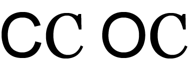
Serif fonts are distinguished by the little tails or embellishments at the ends or corners of the letters. (What you’re reading right now is serif font!) These extra strokes are intended to make the typeface easier to read in print. They can be used for headers or paragraphs of text.
- Some adjectives that often go along with serif fonts are: classic, mature, and reliable
- Some very common examples are: Times New Roman and Georgia
SANS SERIF
These fonts do not have the extra embellishments (called serifs!) attached to them. (The all-caps heading above is a sans serif font.) This makes the letters look more clean and modern. Sans serif fonts can also be used for both headers and paragraphs of text.
- Some adjectives that often go along with sans serif fonts are: modern, confident, and bold
- Some very common examples are: Arial and Helvetica
Here’s an image, which may illustrate the difference between serif and sans serif better than my written description!
SCRIPT
Script fonts are intended to look hand-written. They are typically a bit fancier or special and sometimes more difficult to read than a serif or sans serif font. For this reason, they are usually best used for headers or special text.
- Some common examples of script fonts: Allura and Euphoria
DISPLAY
Display fonts are a little more challenging to categorize. They can include serif, sans serif, or even script-looking lettering. In essence, a display font is defined as a font intended to be used for large headings only. They look great in large, easily-readable sizes, but are very challenging to read if the size is too small.
THREE THINGS TO CONSIDER WHEN SELECTING YOUR FONTS FOR YOUR WEBSITE:
1) Keep it simple.
Choose 2 or 3 fonts MAXIMUM. Too many different fonts looks like visual overwhelm and is a dead giveaway for DIY design. Pick a few and stick to them as you build your brand or business.
2) Use contrast.
I recommend choosing fonts from different categories and pairing them together. This is called a font pairing. Only slightly less fun than a wine pairing.
For instance, you might use a modern-looking sans serif font for your headings and a serif font for your body text. If you’re thinking:
- “This feels limiting!”
- “But I want to use all the pretty fonts!”
- “This looks boring.”
You are wrong, my friend! There are great ways to create contrast and visual interest in your website design, while still only sticking to a few different fonts. You can try:
- Using different weights
- Playing with different letter casings; for instance, on my website, all of my small headings are capitalized
- Using italics or underlining specific words for impact
- Playing with letter spacing
There are so many options for creating subtle, yet impactful differences in your use of font, while still sticking to a cohesive brand scheme.
3) Prioritize clarity.
Don’t get carried away with hard-to-read display fonts. Don’t choose two different script fonts and call it a day. Make sure you have at least 1 or 2 very easy-to-read fonts, so that you can clearly communicate your message with your audience.
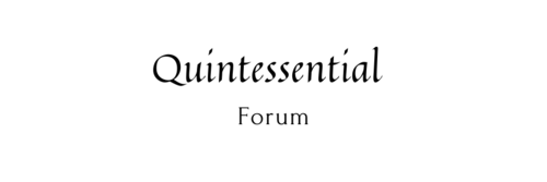
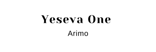
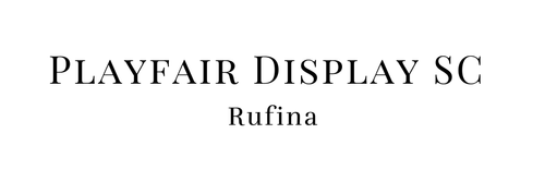
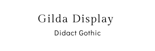
Now, I’m going to give you some ideas for font pairings. All of these fonts are available in Squarespace and BONUS! They’re also all available in Canva, so you can easily use them for your other DIY branding or social media materials.
10 FONT PAIRINGS FOR YOUR SQUARESPACE WEBSITE:


There you have it. A little intro to fonts (ahem, I mean typefaces) and 10 font pairing ideas you can steal for your branding or Squarespace website.
Want to work together? Learn more about how we can grow your creative business with branding and a strategic new website.

DIY design: 10 font pairings available in both Squarespace and Canva
September 16, 2021

