


It’s show and tell time!
I thought I would take a little break from the educational posts I’ve been working on to share an overview of a client project (though I will absolutely share some of the important things I learned during this project!).
I’m happy to share a website that I designed for the most lovely client, Saphren. She’s a Vancouver photographer, specializing in portraits for musicians and creatives, as well as concert and event photos for choirs and other performances. She has done an amazing job shooting some of our choir events and it was fun to get to collaborate on a completely different kind of project – building her a website!
I’ll give a rundown of the planning and design processes and some things that I learned along the way.
PLANNING + MOOD BOARD BUILDING
Saphren’s style is warm and creative – right up my alley! Her Pinterest inspiration board was full of linen textures, earthy colours, and abstract shapes and art. She knew that she wanted lots of colour throughout the website and for the vibe to be relaxed and welcoming.

From her Pinterest board, questionnaire answers, and our conversations during her design consult about the ideal clients she was trying to reach, we landed on this mood board which became the go-to reference point for her website style and aesthetic.
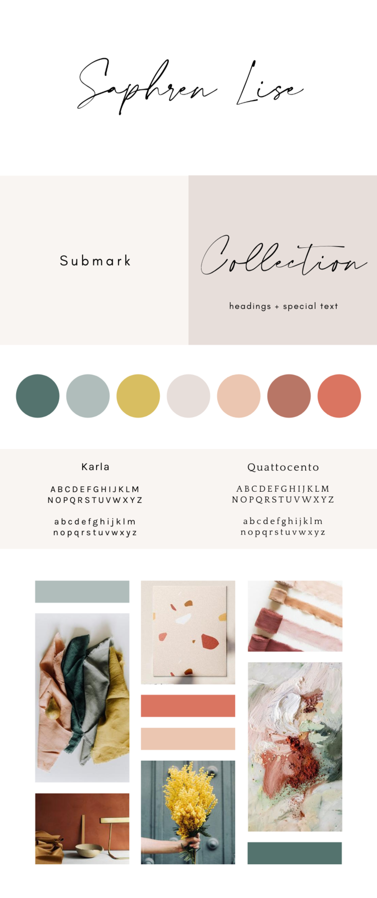
Like I said, on my end – it’s extra fun designing a website when you truly love and resonate with the colour and style choices of your client!!
THE DESIGN PROCESS
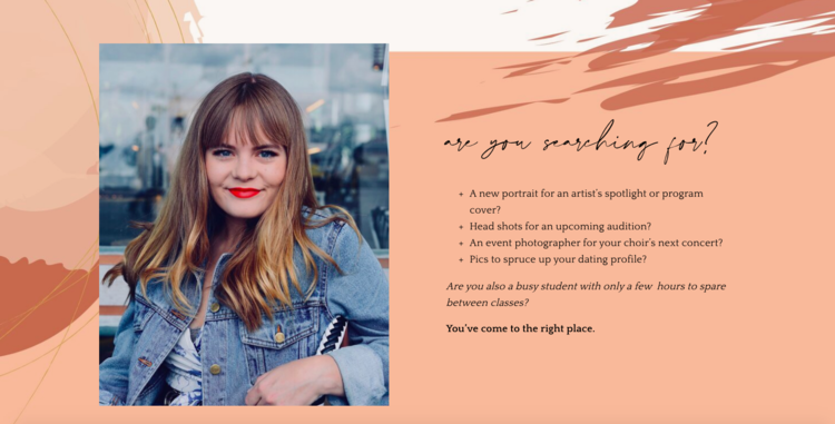
When it came to actually building the website, I had clear guidance from Saphren about design-elements she wanted to have incorporated. Because she’s a visual arts university student (in addition to being an amazing photographer!), she knew she wanted to include graphic elements into the page backgrounds that represent the importance of creativity and art in her own life.
She actually even supplied me with the images to use – what a bonus! As you’ll scroll through her site, you’ll see these wiggly lines and blobs (for lack of better words) woven into the backgrounds, in a sort-of “collage” style.
Here’s what some of these graphics look like actually built into the website.
In terms of the actual structure of the website – how the pages flow from one to another and the way in which potential visitors navigate through the site – the main goal is to have someone book a photoshoot with Saphren.
Here are a couple of considerations and decisions I made to help achieve this goal:
1. Minimal Header
The header navigation menu is intentionally minimal, to provide the visitor with very few opportunities to get distracted, and plenty of opportunities to check out Saphren’s services page and (hopefully!) feel prompted to book her as a photographer. It’s a case of all roads lead to Rome; at the bottom of almost every page, there is a clear call to action to ‘book with saphren.’ On the initial screen of the home page, both the ‘services’ and the ‘book’ navigation titles lead to her services page with a booking form. Similarly, the ‘work with me’ button that is overlaid onto the home page banner, leads to the same page with the booking form. I’m a big fan of minimal options and clear direction – take away any distractions and make the path you would like your site visitors to take plainly obvious.
2. Natural Social Proof:
We debated whether or not to put all of Saphren’s rave reviews from her photography clients into a ‘review/testimonial’ style page, or to weave the reviews throughout each of the main pages on her site. In the end, I actually ended up doing both, but decided the priority should be for the client reviews to be organically woven into her website content.
Why?
- Saphren liked this plan and felt it was less braggy than to have all the reviews in one place. I half-agree, but think a little bit of bragging is important when you’re doing amazing work!!
- The kind things people have said about her perfectly compliment the messaging of her brand and the written content she created (that’s the goal, my friends!!]). For example, what really sets Saphren apart is her ability to make you feel relaxed in front of the camera (NOT an easy task, and I will personally attest to her skills at this). She writes about this in her site content, and of course, her clients have commented on this too in their written testimonials. By putting the testimonials right next to or under her own statement that she’s an expert behind the lens at getting you to relax, it gives credibility and even more authenticity to her statement.
- She’s a photographer and has beautiful photos of the people who have written testimonials for her services. To me, It made more sense to incorporate these photos into her web-pages to showcase her work.
LEARNING MOMENTS DURING THIS PROJECT
Last, I wanted to share some things that I learned during the process of building Saphren’s two-week website.
- This project confirmed that photographers are SO much fun to design for because of the plethora (< new favourite word) of images to choose from.
- At the same time, selecting the images was one of the things we went back and forth on the most during the editing process. I learned that I can be clearer in my initial instructions to future clients to have them specify exactly which pages they would like certain photos to be on (if applicable).
- There are SO many free resources out there for fonts, graphics, and colour selection! We didn’t actually purchase any design assets for this project. Saphren designed the graphics, I sourced the fonts, and we got really creative with free things to work with.
And that’s a wrap on Saphren Lise Photography’s website. If you’re a Vancouver-based creative, book with her for some portraits!

Website Portfolio Spotlight: Saphren Lise Photography
October 29, 2020

